The first version of WingTask was built using Material Design and a first It was fine, it allowed me to launch WingTask quickly without having to take on the burden of creating a custom UI. However, not too far after the launch I began to realize it wasn’t the right choice for look and feel going into the future. The biggest problem is that WingTask needed a UI that was platform neutral, since it’s a web app trying to perform like a native app, it’s not really particularly android nor particularly IOS. The problem with Material Design is that it conveyed that WingTask had a preference for the Android platform which wasn’t really the case.
In the quest to build a better UI I sought out user interface techniques from wherever I could find them: blogs, books, youtube videos, and lots of staring at apps I think are good. After sifting through a multitude of isolated techniques I began to notice there was a group of designers advocating for a systemic and methodical approach to user interface design by the implementation of design systems.
What is a design system?
There isn’t a standard definition of “design system” within the web community, and people use the term in different ways – sometimes interchangeably with “style guides” and “pattern libraries.” [...] by design system I mean a set of connected patterns and shared practices, coherently organized to serve the purposes of a digital product.
Shortly after I came across design systems that took me down a road where I discovered the use of tools called front-end style guides where a design system could be organized in it’s own dedicated workspace. Then from there I found Atomic design which advocated for a hierarchical system of taxonomy where lower level simple components are combined at higher levels to build more complex components. This in turn introduced more techniques as well, the rabbit hole was getting deeper.
I decided that I wanted to build my own set of practices where I combined the practices that I particularly liked. Combined together they would be my own approach to building user interfaces where the end result was a process for creating high quality user interfaces and where high quality is defined as:
- Aesthetically pleasing
- Pleasurable for the users
- Functionally correct and consistent
In 2021 I relaunced WingTask with a new user interface that satisfies in both the end result and the process involved with getting those results. In this article I describe the techniques and processes that were adopted.
-
Atomic Design by Brad Frost
Atomic design provides me with a way to organize my components through a taxonomy and hierarchal system. I created my design system by starting with the smallest pieces of design decisions and then built each successive layer as a composition of pieces from the previous layers. Combining these compositions of compositions and eventually I had complete views for WingTask where each was a composition of small discrete pieces built from lower level components. The advantage to this russian doll approach is that changes can be made in isolation but the those changes get applied consistently across the board.
-
Front end style guide by Storybook
Having decided I wanted a design system, the next question was how to implement it exactly? Specifically how was I going to manage it? I knew I wanted a tool in the form of a style guide, but I didn’t know what exactly the tool would be. A style guide could simply be a collection of html pages showing example user interface decisions or it could be a purpose built component explorer. Storybook is the latter and as a component explorer it helps me both organize what I have and develop what I want. It provides the essential framework for organizing my components as well as having handy features like easy viewing of the same component in different viewports.
-
Cribbing ideas from Form Design Patterns, Inclusive Components, and GOV.UK Design System
What’s the right way to build HTML components? The answer is too big for any one person to possess, certainly not me, and so I try to find good information to guide my development.
When it comes to components I have three sources that I go to for the best component advice:
- Adam Silver through his book Form Design Patterns.
- Heydon Pickering through his book Inclusive Components.
- GOV.UK Design System
The books Form Design Patterns and Inclusive Components are about components, each book does a deep dive into a particular component (menus, tabs, tooltips, modals, autocompletes, etc.) and lays out the case of how to build the component in a way that comports with accessibility guidelines. Now the naive might consider accessibility an option or even more work than what’s necessary but I’ve found that accessibility is the key to using HTML components properly and that doing so results in elegant user interfaces.
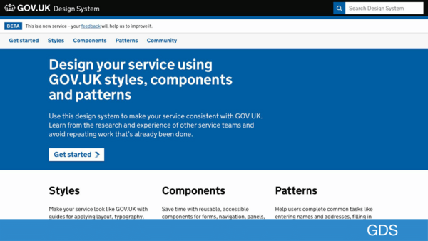
GOV.UK Design System is an authority on accessible HTML, and I consider it a wealth of information regarding how best to build a component. My understanding is that they have a team of smart people with the resources to do extensive user testing so that their advice is guided by both what’s advised by standards and also by what’s happening in practice. I spend time on the UK gov design system site checking out the components and reading up on why certain components are designed the way they are.
-
Paper sketching
I was introduced to the idea of sketching as the first step of interface design by 37Signals now known as Basecamp, they advocate sketching as a way to communicate intent of a feature as well as to provide a guide to ensure that all team members can see what is being built. I use paper sketching as a way to guide later stages of development and to surface any issues that might have been glossed over when I’m simply picturing a feature in my head.

-
Layout mastery with Flexbox and CSS Grid
Responsive design is hard, gone are the days when you could float a couple of divs left and right and call it a day. Investing the time to really understand Flexbox and CSS Grid made me realize that frameworks like Foundation and Bootstrap are not really necessary. I use Flexbox about 90% of the time that I’m doing layout, but the 10% of the time that I’m using CSSGrid I’m using it for layouts of entire sites and apps such as the app shell of WingTask.
-
Components everywhere with HTML Web Components
I think Html Web Components could be one of the most underrated HTML features in the entire browser ecosystem. Somehow the idea got out that if you use React components then there was no point to using Web components, and I’m here to say the reason that’s wrong is that in the construction of a modern webapp and all the ancillary support pages that go along with it, you shouldn’t be using React everywhere even if you build most of your app with it. Web components are an HTML standard and supported by the browser so they can and should be used everywhere.

-
Utility classes with Tailwind CSS and Tailwind UI
My personal journey in building better UI started after I watched the refactoring UI youtube videos where an existing user interface was redesigned in order to improve it. Watching these videos gave me inspiration, I felt like I wanted to try to build UIs that were that good. Adam Wathan and Steve Schoger released the book Refactoring UI which is a book of different tactics for various UI design problems, and underlying each of the tactics was the assertion of a less is more approach through the use of a design system. t described predefining a limited palette of colors, types, and sizes to choose from rather than than getting overwhelmed with infinite possibilities. It was from there that I got the idea to develop my own design system. I started creating a design system from scratch and they released TailwindCSS. At this point the web development world can be divided into two camps, Tailwind CSS zealots, and the people who hate what it does to markup. I started off in the latter camp, but gave Tailwind a reserved try, and now I don’t want to build css without it, it’s a wonderful way to get things done. I also like to leverage Tailwind UI components as starter kits for my own custom components.


This is the first in a series of articles describing how I build user interfaces for WingTask, others in this series are:
How I Sketch Interfaces on Pad and Paper (next)
Storybook is an Essential Tool