Storybook is an essential tool in my development process for WingTask. I depend on it to be the workspace where I create the user interface . Storybook is self-described as “a tool for UI development”, this vague description is not inaccurate in that storybook seems to have a pretty broad set of use
cases it can support.
I took Storybook and molded it into the tool to support my own custom user interace process, it serves various purposes:
A style guide that is a lookup reference
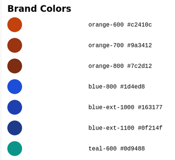
WingTask brand colors in Storybook
What color am I using for secondary text?
What icon am I using for a menu button?
What is the copy for a wrong password error message?
I've wasted too much time reading through
stylesheets to figure out what color I need for the interface I'm building.
Having all the basic building blocks of a UI in a central location where it's
easy to lookup and everyone can see what the right answer is seems like it
should be a no-brainer but without a style guide these things stay obfuscated.
Storybook allows me to pick my colors and other style selections in one central
place.
A design system explorer that displays hierarchy and taxonomy
I use Brad Frost's Atomic Design to organize my components into hierarchy where the lowest level components
get combined and composed into more complex components at the higher levels. Storybook is quite flexible in
how components can be organized. Allowing both the grouping of components as well as breaking down a component
into small pieces. The grouping of components into a hiearchy is represent within the navigation tree in Storybooks sidebar.
A workspace for both isolation and integration
Isolation
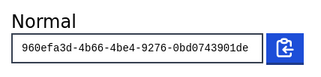
Copy to clipboard component isolated
My past tools included Html 5 Boilerplate because I could generate an html page
and then use it to build some new or experimental blocks of Html, JS, and CSS in
isolation from whatever it was I was working on.
Even more crucial for isolation is debugging because if you have an issue with something in
the user interface there's always the thought in the back of your mind that something
else in some farflung part of the app is causing your problem.
In Storybook isolation means I can create a special page for Buttons and on that page I might have
various buttons showing different states of that button but the whole page will be dedicated to
the being the singular place for working on that button.
Integation
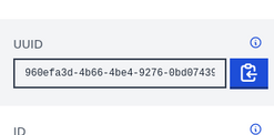
Copy to clipboard component integrated
Nothing in the real world is isolated, once I feel a component is ready I like
to then be able to put it in a view and see what changes either with the view
or the component. The abilty to see a change in both isolation and then while
integrated is the fastest way I know of to find and fix problems with UI.
In Storybook for integration, I'm going to actually assemble what would constitute a single view for WingTask. This means
the entire App shell, plus whatever content is getting rendered inside of the main tag. For a form that allows editing
tasks then it's the form, for a page that lists tasks then it's that page. For an entire view to render correctly it means
that components that were developed in isolation are now working together in context with others.
An inspector for viewports and states
All of the views for WingTask are built for four viewports:
mobile
tablet - portrait
tablet - landscape
desktop
All of the views have one or more states:
normal
error
success
loading / submitting
blank slate
Each view potentially has twenty different combinations of viewport and state, and with a tool like
Storybook it's possible to freeze every state and viewport combination so that it can at
any point be drilled down to and inspected to make sure that the view appears how it should.
Without a tool like Storybook you build the view with viewports and states the first time
then later on just hope everything works ok as you make changes because it's just too
burdensome to try and check each combination after every change.
How I organize Storybook
Atoms
Molecules
Compounts
Layouts
Views
Atoms
Colors
Colors (for WingTask)
I’m a big fan of having all the colors for a project in one place where they are easily viewable. Too much wasted time is spent by developers trying to hunt down brand colors in a sea of stylesheets. After picking the brand colors I want to use for a particular project, I’ll choose colors for the text, how I want my links to look and colors for various states such as error, success, and focus. Colors are selected from the TailwindCSS color palette because the palette was constructed in such a way as to make all of the colors mix and matchable. This is much harder than simply picking a shade for orange and then applying different levels of opacity to it.
Colors will get defined as CSS variables and then again as part of the Tailwind config. The reason for CSS variables is to make theming possible, Tailwind config let’s me define the colors and then have those colors available as TailwindCSS classes.
TailwindCSS Colors
When picking colors for my projects and themes I use the TailwindCSS colors because I know a lot of work went into making the palette a set of colors that could be mixed and matched and still look good together. Depending on someone else for a color palette has saved ne hours of time staring blankly at color palettes.
Typography
Typeface
WingTask uses the system typeface of whatever device the app is being viewed from. I like to keep a table for reference of exactly what those typefaces are.
Typescale
TailwindCSS provides a typescale with a limited number of choices, I like having a reference to it in my Storybook.
Borders
I wanted WingTask to have bright and noticeable colors for when any particular element had focus, and getting it right was actually a lot of work.
Breakpoints
Supporting different devices means choosing breakpoints at which a design is considered to be on a different device. Using a hardcoded pixel value is problematic but it’s the best for now. I have an internal set of values that I use and having the breakpoint values in Storybook is nice.
Breakpoint name
TailwindCSS
Breakpoint in px
mobile
sm
640px
portrait (tablet)
md
768px
landscape (tablet)
lg
1024px
desktop
xl
1280px
Error Messages
Error messages are another thing I wanted to predefine in Storybook as part of my design system because I feel like every time I write a user interface that needs to give feedback to the user, such as validation error messages for forms, I’m reinventing the language I’m using for those error messages, and probably confusing the user as well. My error messages were wholly cribbed from the Error Messages component of The GOV.UK Design System. I figure they probably developed the language for messages through testing and I’d do fine to just emulate their work.
Icons
This is another area where doing a little work up front can make design and working with icons so much easier. I use a subset of heroicons by Steve Schoger.
Molecules
Molecules represent a single component that might be used on its own or combined with other molecules as part of a compound. These are things like input, button, and label.
Separate Web Component and Elm Stories
WingTask is a web app that uses web components and Elm in it’s front-end. Web components are developed first
and they are design to be framework agnostic, I might use the web component in a client side Elm app or I might also use it
in a server-side RubyonRails app. It takes a level of effort to build a web component and then
it takes another level of effort to build an Elm wrapper for that component. I like to keep these separate
so that if something breaks it’s easy to figure out where the problem is.
Multiple States
Some components are shown multiple times for each state the component supports, this makes it easy to get an understanding of which states the component supports and what it should look like in that particular state. Later if an error comes up with the componentthis story can be referenced to see what the component is supposed to look like.
Events
Web components are interacted with via attributes and in turn they dispatch events. Some stories are wired up to make sure these events are happening as expected so that as part of a debugging process a developer could click to take an action and see that the event listener fired and updated the DOM. The same thing is available for Elm component wrappers.
Compounds
Compounds represent more complex entities that are usually made up of multiple molecules. The division between what is a compound and what is a molecule is not made by a strict list of heuristics but just kind of what feels right in terms of how I want things organized. With compounds, the structure of separate stories for web components and Elm are included as well as multiple states per story. Some stories don’t have anything to do with a web component so they might be listed simply as Html. Some stories will be divided by viewport because I want to be able to quickly see what a compound looks like in different sizes. The big picture idea is that the compounds section closely tracks what’s going to go in the app and the structure for this section is arbitrarily based on what’s needed to get the job done at that moment.
Layouts
CSS Grid and flexbox make it possible to do complex responsive layouts, and though it’s easier than it’s ever been, making a layout work across multiple viewports can’t be said to be easy. The Layout section of Storybook is to show the structure of the app shell for WingTask devoid of any content so that it’s easy to see what parts of the markup and CSS go into making the layout happen. Occasionally, some change might cause the layout to break so it’s nice to have this section in Storybook as a reference that can be used for diffing to see what might have caused the breakage.
Views
Views started out as a way for me to construct the view portions of WingTask without actually having to build them as code within the app code. The reason for doing this is that I wanted to take advantage of Storybook’s ability to iterate quickly on design due to being isolated from the app code. At first I built all the views in HTML only because it’s the simplest representation of a view. I then converted those HTML views into Elm views using Elm view syntax and the Elm component wrappers. These views were not actual views for the app in the sense that they had hardcoded values instead of dynamic fields. Eventually I was able to take these Elm views and then use them in WingTask as actual code. I copied and pasted the views over to the WingTask code base and then wired them up to handle events.
Over time I ran into an issue which is that I was making changes in the WingTask app that were not getting ported back to Storybook. This introduced a disparity that threatened to make it so that either I had a major chore in making sure that changes made in WingTask frontend were also being made in Storybook, or I had to accept that Storybook could no longer be used as a tool for working on WingTask views because of this code syncing problem.
I found a solution to the problem and it turned out to be to replace the hardcoded Elm views in Storybook with the actual views from WingTask. This works because Storybook renders the story content inside an iframe and because Elm is flexible in the way that it can be initialized and configured. Additionally, Elm like React renders it’s UI views according to it’s central state meaning that you can inject the central state as you need to in order to display any particular view. This is handy.
This is third in a series of articles describing how I build user interfaces for WingTask, others in this series are: